How to choose wall colour is rarely as simple as picking a shade you like. A client came in last spring almost in tears. She’d just repainted her sitting room for the second time in six months. The first colour, a cool dove grey she’d been certain about, had turned green in the Algarve light by week two. The second attempt, meant to be a safe warm cream, had gone yellow against the new oak floor. She wanted to know if there was a colour that would just work.
There isn’t. Or rather, there is, but you can’t choose it the way she chose the first two.
Here’s the thing nobody tells you when you walk into a paint shop. The wall colour is not the first decision. It’s nearly the last. Floor first. Then the big pieces of furniture you’re committed to. Then the curtains, the rugs, the lamps. Then, with all of that actually in the room, you choose the wall. Most people do this in reverse and then wonder why the room is fighting itself.
I know this because I watch it happen. Often.
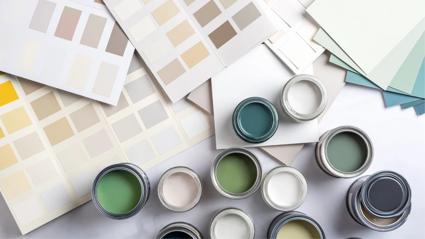
The other thing people get wrong is the swatch. They paint a square the size of a postcard, look at it for ten minutes on a Saturday afternoon, and decide. That’s not a test. A real test is at least 50cm by 50cm, painted on at least two walls (because adjacent walls catch light completely differently), and watched across a full day. Morning. Midday. Late afternoon. And critically, evening with your actual lamps on, because most people spend more hours in their living room under artificial light than under sun. The way light interacts with paint is the single most underrated factor in colour decisions.
A tester pot costs a few euros. A wrongly painted room costs a weekend and a few hundred. The maths is obvious and yet.
Most colour advice was written for somewhere that isn’t the Algarve. The light here sits higher and stronger and runs warmer for more months of the year than light in London or Berlin or Stockholm. Colours behave differently. Cool greys go green. Pale neutrals can wash to nothing by mid-afternoon. Pure white turns harsh.
What does work, then. Warm whites, by which I mean whites with cream or stone in them rather than blue. Farrow & Ball’s Wimborne White is a reasonable safe bet. Little Greene’s Slaked Lime is better, in my opinion, in a south-facing room. CIN does similar shades for considerably less money if budget is a factor and they hold up surprisingly well. Sage and olive greens, especially in rooms that look out onto a garden or pool, where the colour effectively continues the landscape. Terracotta and warm clay tones, used fully, all four walls, on a dining room or a study (not a living room: the saturation is too much for somewhere you sit reading on a Sunday). Deep teals and dark greens, which have aged into something more enduring than the dark navies they replaced.
Greys are tricky. The greys that survive Algarve light are warm greys, almost taupes. Anything cool tips toward green or blue and starts to feel cold even in summer. Pastels generally don’t work either. They either fade out under the strong light or read as washed-out by afternoon.
About colour drenching, the practice of taking the wall colour all the way up onto the ceiling. It’s been treated as braver than it is. In the right room (good proportions, decent light, used for atmosphere rather than daylight productivity) it works beautifully. In a small low-ceilinged bedroom with one window, the same approach feels like being inside a box. The room has to carry it. Most rooms can’t.
Back to the client from spring. We didn’t choose her a colour that day. I told her to go home, leave the walls white, sort the curtains and the new sofa first. She came back six weeks later with photos and we landed on a warm off-white from Little Greene’s range that read as cream in morning light and almost peach in late afternoon. It’s been on her walls for nearly a year now without complaint. The colour wasn’t the answer. The order was.
If you’re at the point of considering wall colour seriously, come into Albufeira or Armação de Pêra and bring photos of what’s already in the room. Or what’s about to be in the room. Looking at colour decisions next to actual fabrics and finishes is a different exercise from looking at a swatch in a shop, and it usually closes the gap between what you’re imagining and what you’ll actually be living with.